Xami AI
2026
A conversational AI workspace designed as a system with presence, continuity, and its own interaction language.
Overview
Xami began with a simple tension: the response model could be powerful, yet the product around it could still feel like a text field floating in an empty room.
A useful AI client has to hold more than a conversation. It needs to make tools discoverable, preserve context between chats, organise projects and files, communicate what the agent is doing, and remain calm while the interface changes state.
I designed Xami as one persistent workspace: a conversational surface, a project and file layer, a command search, and a small visual presence that ties empty, thinking, error, and onboarding states together. The same component and token system carries all of those surfaces rather than treating each page as a separate product.
Designing the system before the screens
A product with chat, files, projects, onboarding, settings, overlays, and two themes can quickly become a collection of polished but unrelated screens. The risk was not a lack of ideas; it was losing the reasoning that connected them as the interface grew.
I needed a process that made each decision reusable. Before building a major surface, I wrote its structural and motion rules, tested new primitives in isolation, and only then composed them into the product. Once a component was verified, I documented what it did, why it existed, the decisions inside it, and how it should be used.
The working rhythm became: build one thing, write down why, then build the next thing. Twenty nine internal notes, roughly 17,400 words, became a living record of the system. The implementation order stayed deliberate: primitives first, overlays next, then the shell, conversation, and finally the wider workspace.
- Write the behavior and transition spec before touching the surrounding shell.
- Build each primitive with its states, sizes, variants, and failure cases visible together.
- Verify the component in isolation, then compose it into a real product flow.
- Run type and production checks before treating the work as finished.
- Record the decision while its tradeoffs are still fresh enough to be useful later.
Build one thing. Write down why. Then build the next thing.
Designing an AI with presence
Most AI products communicate personality through copy alone. When the conversation has not started, or while a response is being prepared, the product itself can feel absent.
Adding a conventional character would have pulled too much attention from the work. The presence needed to be expressive at a glance, legible at several sizes, and abstract enough to appear in the product without turning every loading state into branding.
I built a 5×5 dot matrix whose expressions are stored as data. The dots never move position; their intensity and scale morph between frames, with a small stagger moving outward from the centre to create the feeling of motion. The same engine can idle, glance, blink, think, scan, celebrate, or show an error while the surrounding component chooses the appropriate expression.
The mascot is reserved for moments where Xami’s presence should be felt. It is not a replacement for every spinner, badge, or loading state.
Building the foundations first
The interface needed to stay coherent across the chat shell, overlays, forms, projects, files, settings, dark mode, and light mode. Styling each screen independently would have made every new feature slower and less predictable.
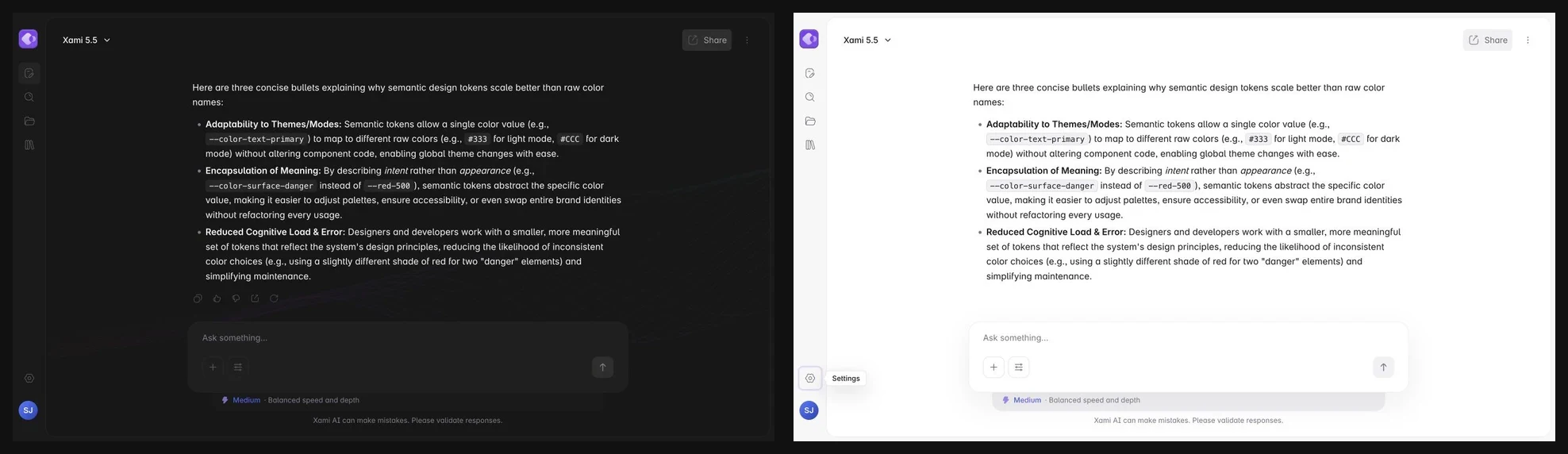
I treated the system as a product dependency rather than a cleanup task. Primitive scales define spacing, radii, typography, duration, easing, and elevation. Semantic tokens then describe the consumer, such as a primary button ring or an input error edge, so a visual change can travel through the product without rewriting component CSS.
The resulting foundation contains 198 design tokens and a custom component library using React, TypeScript, CSS Modules, and Framer Motion. Components consume tokens instead of fixed colour values, related controls compose the same primitive, and the full light theme is produced by remapping semantic values rather than editing component files.
- Name colour tokens for their responsibility, not for a numbered shade.
- Alias component tokens to a smaller source of truth so global tuning stays possible.
- Use translucent interaction colours that can layer over more than one surface.
- Keep motion to three durations and a small set of paired easing curves.
Building the components for Xami
Xami needed many different controls across chat, projects, files, settings, and onboarding. Building each screen independently would have repeated the same interaction decisions and made the product harder to maintain.
I built the shared behavior once and composed it throughout the project. Each component owns the details its parent screens should not have to repeat, including focus treatment, keyboard logic, portal positioning, theme support, and reduced motion.
The project grew to roughly sixty reusable components without an external UI dependency. Buttons and icon buttons share one interaction model; Toggle owns its elastic movement; Checkbox draws its confirmation; RadioGroup owns roving focus; Tooltip portals outside clipping containers; and chips, attachments, and the composer combine those smaller rules into richer product controls.
- Primitives own interaction and accessibility; product surfaces own context.
- Variants reuse structure instead of introducing similar controls.
- The motion scale is shared, so a small toggle and a large overlay still feel related.
- Testing every state together exposed edge cases before they became buried inside a page.
Designing onboarding as one flow
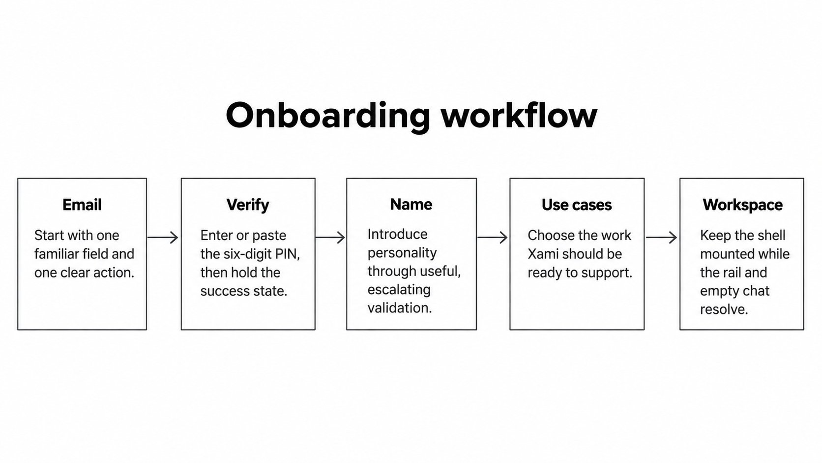
Email, verification, a name, and intended use are four distinct questions, but presenting them as four destinations would make a short introduction feel like a funnel. The larger break came at the end: a normal route change made onboarding vanish before the workspace appeared.
The user should feel the product becoming available around them, not feel transported to another website. That meant preserving one shell, replacing only the step content, acknowledging successful actions before advancing, and treating the final handoff as part of onboarding rather than navigation after it.
The complete flow lives on one route with four internal steps: email, a six digit PIN that supports pasting, name, and selectable use cases. Validation grows more specific across repeated attempts, including a sad Xami expression when the name is left blank. Successful steps hold for about 750ms, then the final card sweeps into the sidebar position while the rail and app content resolve around it. People who prefer reduced motion receive the same state change immediately.
Keeping the conversation continuous
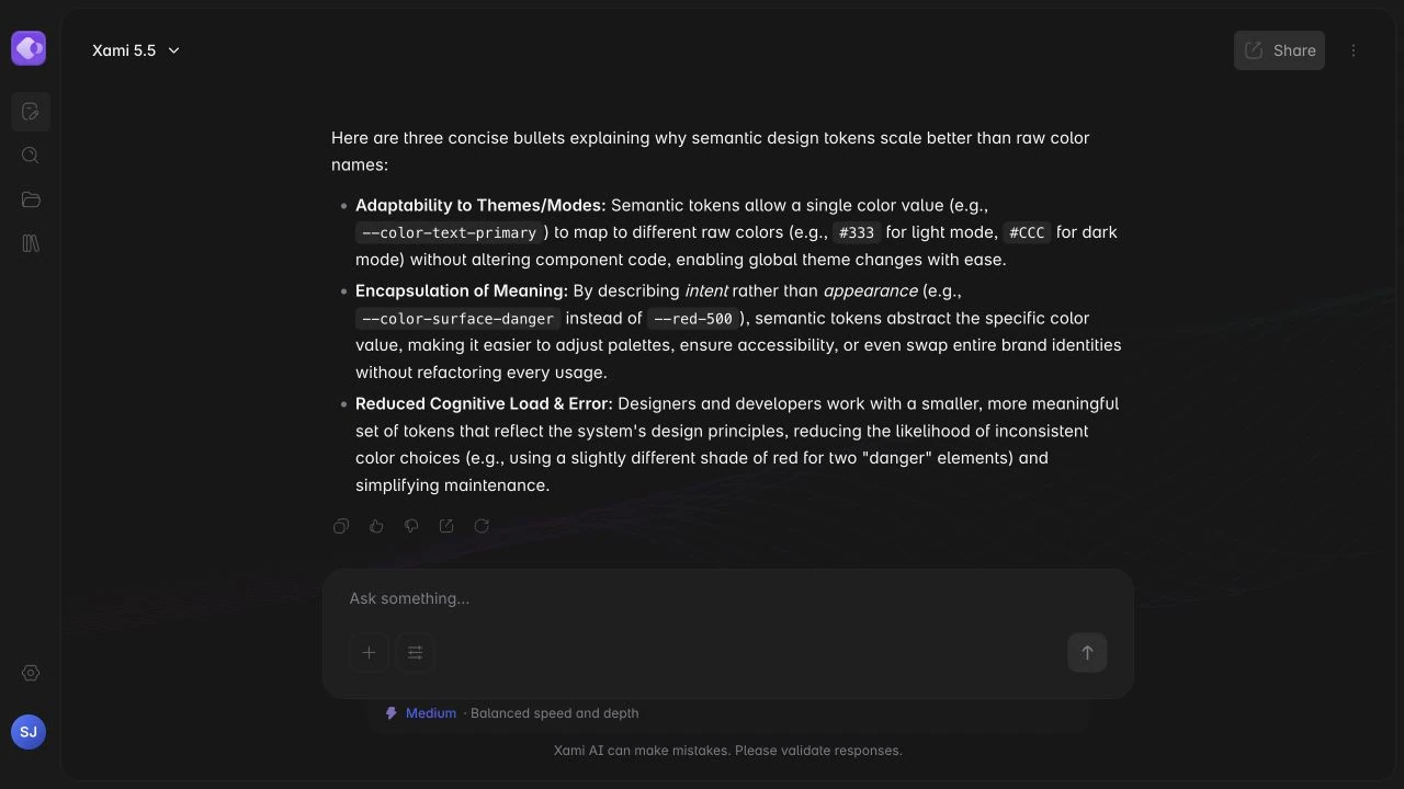
The empty state and an active conversation are visually different layouts, but replacing one page with another made the most important element, the composer, feel as if it disappeared and returned somewhere else.
Continuity matters most around the object the user is already touching. If the composer stays mounted, the interface can reveal a thread around it instead of cutting to a new screen. The same principle applies to streaming: new text should arrive without pushing controls around or making the thinking disclosure dominate the page.
The composer is one persistent element that moves from the centre to the bottom while the empty state hero leaves and the thread opens above it. Messages support partial markdown, code, attachments, editing, regeneration, and cancellation. The thinking view uses a fixed window with edge fades and controlled automatic scrolling so the page does not jump while reasoning arrives.
Expanding chat into a workspace
A useful conversation rarely lives alone. Chats need project context, files need somewhere to remain available, and returning users need a faster route to previous work than scanning a sidebar.
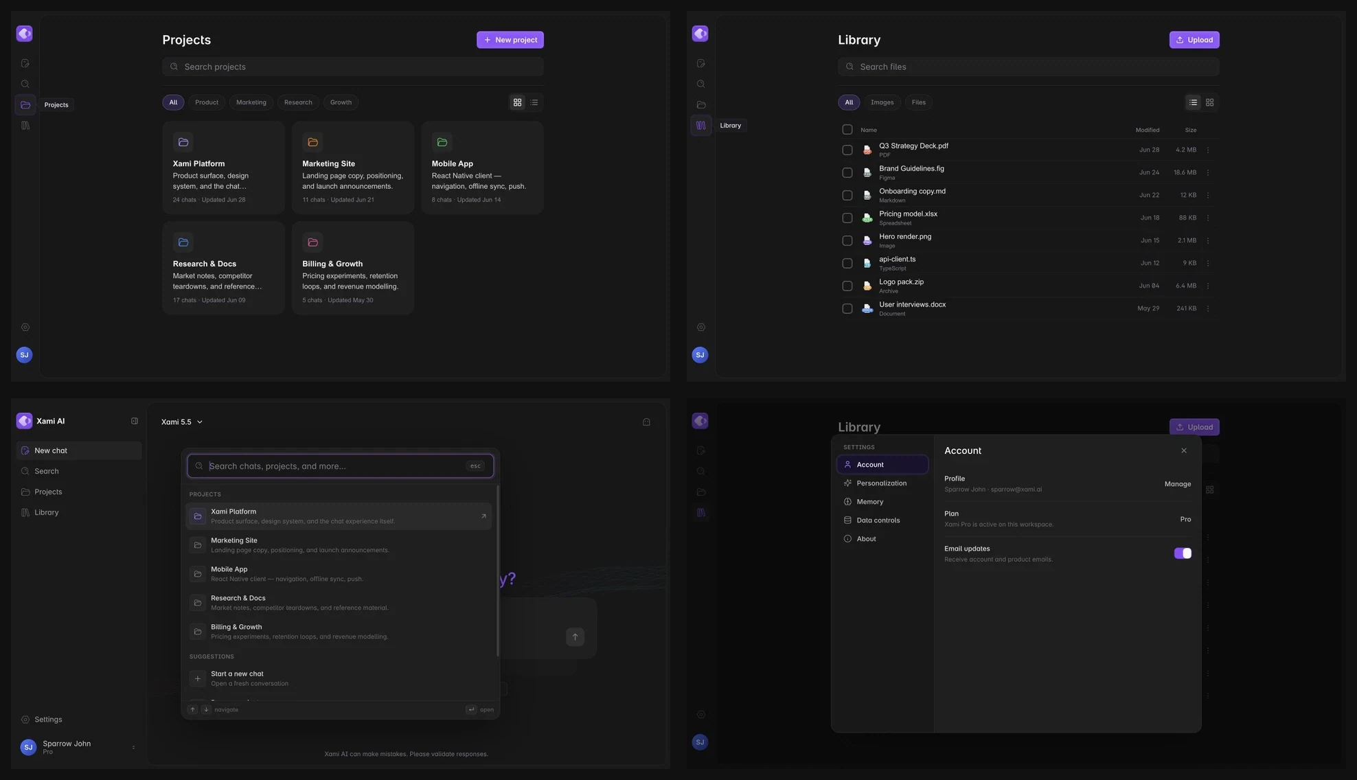
These surfaces had to feel like extensions of the conversation rather than separate admin screens. That meant reusing the same toolbar patterns, filters, chips, overlays, focus behavior, and density while allowing each information type to choose the layout that fits it.
Projects organise related conversations and context, Library handles reusable files, command search crosses destinations from one keyboard focused overlay, and Settings keeps account and behaviour controls out of the main workflow. Grid and list views switch honestly with a crossfade because their containers do not share enough geometry for a convincing layout tween.
Thought process: choosing the honest interaction
Several interactions looked convincing in isolation and failed once they crossed real component boundaries, routes, overflow containers, or product state. The first implementation often revealed that the visual idea and the ownership model did not match.
My rule became: locate the smallest layer that truly owns the behavior, then make the visual decision honest about that structure. A transition that works only in a demo, a chat model that supports one conversation, or a tooltip that survives only outside an overflow container is not a reusable system yet.
For each difficult interaction I documented the intent, the first attempt, why it broke, and the rule that shipped. Responsibility moved upward when necessary: the persistent shell owns continuity, the store owns multiple chat state, the document body owns floating overlays, and the collection owns the change between grid and list.
- Onboarding could not animate across a route teardown, so one shell now owns the transition phase and updates the URL after the movement settles.
- Grid and list layouts could not convincingly tween across different container models, so the collection now crossfades and replays a restrained entrance.
- A single view chat hook could not support recents or refreshed chat routes, so conversations moved into a store keyed by id with a cancellable stream for each chat.
- Composer tooltips were clipped by an overflow boundary, so the shared Tooltip now portals to the document body and positions from the trigger rect.
- Repeated invalid submissions did not replay the same shake, so each attempt now changes the validation state instead of toggling one static error flag.
- Animation completion callbacks could race with a new transition, so the active completion path is latched in a ref and stale callbacks are ignored.
Sometimes the professional animation is the honest crossfade, not a forced morph between two layouts that are not the same object.
Enforcing access at the boundary
A component library can make accessibility easier to repeat, or repeat the same omission everywhere. Icon controls, animated state, keyboard groups, overlays, and reduced motion all needed rules that did not depend on remembering a checklist on every page.
The strongest place to enforce those rules is the component boundary. If an icon button cannot compile without a label and a radio cannot exist outside the group that owns its keyboard model, misuse becomes harder than the correct implementation.
IconButton requires an accessible label in TypeScript, RadioGroup implements roving tabindex and arrow key selection, visible focus rings remain distinct from decorative component rings, tooltips are limited to devices with hover input, and every animated primitive provides an immediate reduced motion state.
- Assistive technology receives state changes immediately rather than waiting for motion to finish.
- Keyboard focus remains visible even on controls that already have a decorative ring.
- Touch devices never depend on controls that only appear on hover or on sticky tooltips.
- Reduced motion removes the transition instead of replacing it with a different animation.
Where it stands
Xami is still in development, so the case study needs to separate the working interface from the infrastructure still being developed.
Treating every polished screen as a finished capability would make the visual work less credible. The right status is based on what a person can use now, what currently survives only in memory, and what still depends on a future backend concept.
The component system, responsive shell, conversation surface, streamed responses, navigation between chats, Projects, Library, command search, settings, overlays, and light theme are working. Persistence is still in progress, so refreshing can clear conversational state, and several secondary actions remain presentational until the data model behind them exists.
- Working: the complete interaction shell and the core flow from conversation to workspace.
- In progress: durable persistence and the backend models behind secondary actions.
- Deliberately deferred: features whose interface exists but whose product behavior is not yet defined well enough to ship.
What I learned
The polish people notice at the surface is usually the result of decisions made much earlier in tokens, state, composition, and motion rules.
The expensive corrections happened when the implementation model was smaller than the product being implied: one chat behind a sidebar designed for many chats, separate routes behind a continuous transition, and local overlays inside containers that could clip them.
Building Xami changed the order in which I now approach product interfaces. I define the semantic system, the state ownership, and the motion grammar before multiplying screens, then use the screens to test whether those foundations are honest.
- Tokens become architecture when they describe responsibility instead of appearance.
- Motion feels coherent when it has shared timing, clear ownership, and permission to do less.
- A product’s state model has to support the promise already visible in its interface.
- Personality is more effective when it is reserved for moments that actually need presence.
- Accessibility scales best when components enforce it before a page can forget it.