Edge Lab
2026
An interactive research tool for understanding why some interface edges feel crisp while conventional borders turn muddy.
Overview
Edge Lab began with a small visual frustration: interface borders that were technically correct but still looked heavy, flat, or blurred once a shadow sat behind them.
The problem was not isolated to one component. Inputs, cards, buttons, and dividers all needed an edge that could survive different surfaces, themes, states, and rendering engines without becoming a pile of one-off colour values.
I turned the investigation into a live visual lab. Instead of presenting a finished recipe as fact, the tool lets designers and developers compare approaches, separate the layers, push the values until they fail, and export a version they understand.
The border problem
A solid grey border and a depth shadow are two separate lines competing for the same edge. Where the hard border meets the soft shadow, the transition can read as dirt rather than depth.
Changing the grey did not solve the relationship. A colour that looked acceptable on white could disappear on an off-white surface, while a darker value became too assertive. The edge needed to inherit more from its environment instead of fighting it.
The working direction became a translucent near-black ring layered with tightly contained depth shadows. Because the ring allows the background and shadow beneath it to influence the final colour, the eye reads one continuous rim instead of a border pasted over a shadow.
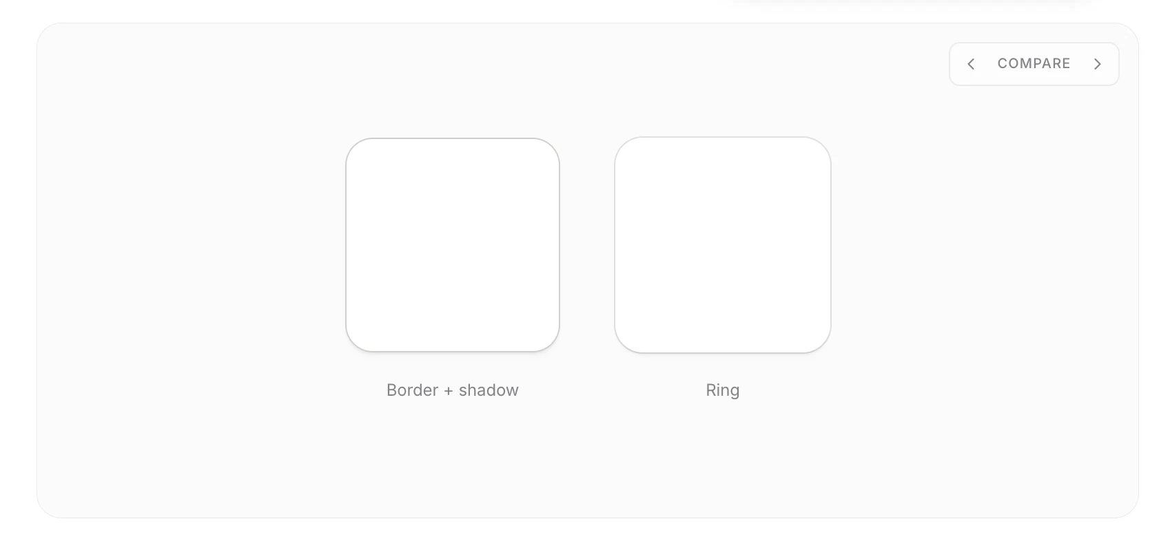
The useful question stopped being ‘Which grey should this border be?’ and became ‘What should this edge inherit from the surface beneath it?’
Researching crisp edges
The technique already had a lineage. James McDonald demonstrated a spread shadow used as the border with a white inner shadow above it; other practitioners expanded the idea with negative spread, translucent rings, and different dark-mode lighting models.
Linear’s light-mode treatment suggested another direction: adapt the apparent hairline to the rendering context, using a finer 0.5px treatment where it stays crisp and a safer 1px value where fractional pixels may round poorly. The reference material also warned that browsers and display densities do not resolve half-pixels consistently, so this became a hypothesis to validate rather than a browser rule to copy.
I separated the research into principles and implementation choices. Opacity, layer order, and the relationship between ring and depth could become stable rules. Fractional widths, theme-specific values, and rendering-engine behavior remained variables that needed direct browser testing.
- A zero-blur spread shadow can behave like a border without participating in layout.
- Low-opacity near-black adapts to changing light surfaces more naturally than a fixed grey.
- Negative spread keeps depth layers inside the edge silhouette instead of producing a halo.
- Half-pixel edges are useful only when the device and browser render them predictably.
Forming the edge system
A single shadow value could make one resting input look good, but it was not yet a system. The same edge had to explain depth, survive interaction states, and remain legible in both light and dark environments.
Treating the effect as a stack made each responsibility visible: the ring defines the silhouette, a tight contact shadow gives the edge weight, and a wider ambient shadow creates distance from the surface. State changes then adjust the stack instead of replacing it with unrelated effects.
Edge Lab exposes those layers independently. The resting state starts with a quiet ring and contained depth; hover strengthens the ring and contact shadow; pointer focus adds a restrained halo; keyboard focus becomes intentionally louder; dark mode re-derives the stack with an inset edge and a lit rather than black halo.
- Ring: zero offset and blur, defining the crisp silhouette.
- Contact: tight depth with negative spread, keeping weight close to the component.
- Ambient: a softer layer that describes distance without bleeding past the corners.
Designing the interactive lab
Static documentation could show a preferred value, but it could not explain why the value worked or where it stopped working. Readers needed to see the edge respond while the underlying variables changed.
The interaction model had to support two modes of learning. Compare gives an immediate visual answer for someone arriving cold. Layers slows the effect down for someone who wants to inspect the construction. The default values provide a reliable starting point, while free controls expose the failure boundaries.
I kept every control tied to the preview with immediate feedback: opacity changes the ring, depth reshapes the shadow stack, theme changes the lighting model, and state controls reveal how the same grammar behaves under hover, focus, invalid, and read-only conditions.
The controls are not there to decorate the result. They let the reader cross the line between crisp, invisible, and visibly drawn.
From design to code
A visual formula is only useful when it can move between the design file and the implementation without losing layer order, spread values, theme behavior, or interaction states.
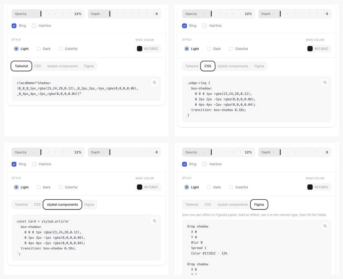
Different consumers describe the same effect differently. Figma presents an ordered effects list; CSS uses comma-separated shadows; Tailwind compresses the stack into utilities or tokens; component libraries need reusable state variants. The tool needed to preserve the underlying idea across each format.
Edge Lab translates the configured stack into copy-ready CSS, Tailwind, styled-components, and Figma guidance. The exports keep the ring first in paint order, retain negative spread on depth layers, and separate the dark-mode recipe rather than pretending it is a recoloured light-mode shadow.
Testing across real conditions
The most fragile part of the idea was not the formula itself but how finely rendered edges changed across browser engines, zoom levels, pixel densities, themes, and neighboring surfaces.
A 0.5px edge can look exceptionally sharp on a high-density display and then disappear or snap to a full pixel elsewhere. An outset ring can also grow the visual footprint beside a real border, while a dark halo can read as a hole instead of focus. Each decision needed a fallback and a condition for use.
Rather than turn one browser result into a universal rule, I treated the 0.5px hairline as a progressive enhancement. Chrome and Safari can resolve the same fractional edge differently because browser rounding, zoom, and device pixel ratio all affect the final pixel. The component therefore uses the finer value only where it remains visible and returns to a dependable 1px edge everywhere else.
The comparison method keeps the component, surface, theme, and zoom level fixed, then changes only the edge width. A result is useful only if the resting edge remains visible, the shadow still reads as depth, and keyboard focus stays clearly stronger than the decorative rim.
This keeps the research practical: the half pixel treatment is available when the rendering environment supports it, but the design never depends on fractional rendering for essential contrast or state communication.
- Do not make a fractional layer responsible for essential contrast.
- Check the composed result in the browser; the design file is a model, not the final pixel.
- Re-derive dark mode structurally instead of multiplying light-mode opacity by instinct.
- Keep keyboard focus unmistakable even when the resting edge is deliberately quiet.
What I learned
The smallest visual details become useful design work when they are treated as relationships rather than isolated values.
The crispness did not come from finding a perfect grey or a universally correct pixel width. It came from understanding how an edge, the surface beneath it, the depth behind it, the display density, and the interaction state influence one another.
Building the lab also changed how I document visual systems. Showing a final token is not enough; the strongest explanation lets people inspect the construction, see it fail, and leave with both a usable result and the reasoning required to adapt it.
- Research is more credible when borrowed techniques are traced and tested instead of presented as invention.
- A good design token stores a relationship, not merely a value.
- Interactive documentation can make visual judgment teachable without pretending it is purely objective.
- Browser behavior belongs inside the design decision, not at the end as an engineering caveat.